Methods of Presenting Data

Textual Form
The textual form is also known as the narrative form. It is used to present data in paragraphs or as mentioned, in narrative form. It is simple but appropriate when there are few numbers to be presented. When using the textual form, the data should be comprehensible even when written in paragraph form.

Tabular Form
It is a systematic way of arranging data in columns and rows according to classifications or categories. The tabular form is a very effective and efficient means of organizing and summarizing data because a lot of information can be seen from a single table and it makes the comparison of figures quick under each category. A statistical table must consist of the following parts:

Table Heading
It includes the table number and the title.
Body
It is the main part of the table containing the figures being presented.
Stubs or Classes
These are the categories describing the data, usually found on the left-hand side of the table.
Caption
These are the designations of the information contained in a column, usually found at the top of the column.
What is a Frequency Distribution Table or FDT?
A frequency distribution is a tabular presentation of qualitative or quantitative data grouped into categorical or non-overlapping numerical intervals or called classes together with the number of observations in each class.
When the frequency distribution is grouped according to some categorical or non-numerical value then it is called a qualitative frequency distribution
When the frequency distribution is grouped according to numerical intervals, then it is called a quantitative frequency distribution. It is a simple, effective method of organizing and presenting numerical data so that one can grasp an overall picture of the distribution, where measurements are concentrated, and how spread out they are.
Steps in constructing a Frequency Distribution Table
1. Determine the Range of the set of observations
Range = highest value - lowest value
2. Determine the approximate number of class intervals, k.
k=√N (where N = number of observations)
3. Obtain the class width or size, c.
c = R/k (The class width must have the same decimal digit as the raw data and be rounded off to an odd number.)
4. For the class intervals, the lowest value will be the first lower limit and the class size, c, is added successively. The upper limit = lower limit + c - 1 unit measure (a unit measure refers to the indicated place value at which the raw data are rounded off. Example: 3.4 (0.1 unit measure), 24 (1 unit measure), 8.279 (0.001 unit measure).
Example
Given the midterm exam scores of 30 students, construct the FDT:
29, 18, 12, 28, 50, 31, 29, 14, 37, 40,21, 22, 21, 24, 20, 14, 27, 30, 38, 35,
26, 28, 13, 16, 18, 31, 15, 22, 27, 37
1. Range = 50 - 12 = 38
2. k = √30 = 5.48 ~ 5
3. c = 38/5 = 7.6, where 7 is the nearest odd number
4. 1st lower limit = 12; 1st upper limit = 12 + 7 - 1 = 18
Thus the resulting FDT:
| Class Interval | Frequency |
|---|---|
| 12 - 18 | 8 |
| 19 - 25 | 6 |
| 26 - 32 | 10 |
| 33 - 39 | 4 |
| 40 - 46 | 1 |
| 47 - 53 | 1 |
| Total (N) | 3 |
Other information related to the FDT
1. True Class Boundaries (the real limits of each class interval)
Lower True Class Boundaries (LTCB) = Lower limit - 1/2 unit measure
Upper True Class Boundaries (UTCB) = Upper Limit - 1/2 unit measure
2. Class Mark (CM: midpoint of each class interval)
CM = 1/2 (Lower Limit + Upper Limit)
3. Relative Frequency (RF: proportion of observation in each class interval)
RF = f/N or f/N x 100%
4. Cumulative Frequency (cF)
Less than Cumulative Frequency (<cF) - summing up the frequencies starting with the frequency of the lowest valued class interval.
5. Ranks: The class interval with the highest frequency is ranked 1, followed by the lower frequency value, and so on. Frequencies with tied ranks will be averaged.
| Class Interval (CI) | Frequency (f) | True Class Boundaries (TCB) | Class Mark (CM) | Relative Frequency in % | Lesser than cF | Greater than cF | Ranks |
|---|---|---|---|---|---|---|---|
| 12 - 18 | 8 | 11.5 - 18.5 | 15 | 27 | 8 | 30 | 2 |
| 19 - 25 | 6 | 18.5 - 25.5 | 22 | 20 | 14 | 22 | 3 |
| 26 - 32 | 10 | 25.5 - 32.5 | 29 | 33 | 24 | 16 | 1 |
| 33 - 39 | 4 | 32.5 - 39.5 | 36 | 13 | 28 | 6 | 4 |
| 40 - 46 | 1 | 39.5 - 46.5 | 43 | 3 | 29 | 2 | 5.5 |
| 47 - 53 | 1 | 46.5 - 53.5 | 50 | 3 | 30 | 1 | 5.5 |
| Total (N) | 30 | 100 |
Graphical Form
A graph or chart is a pictorial presentation of a set of data. It shows a general situation at a glance. Each graph or chart must have a figure number and a title. If data is based on another source, a source not should be included. Some of the most commonly used graphs are:
Bar graph

It represents the frequency or magnitudes of quantities of each of the categories as a bar rising vertically from the horizontal axis with the height of each bar proportional to the frequency or magnitude of the corresponding category. It may be simple, compound, and can be vertically or horizontally arranged. It is used for both quantitative and qualitative data.
Line graph

This is obtained by plotting the frequency of a category above the point on the horizontal axis representing that category and then joining the points with straight lines (or broken lines). Line graphs are used to show fluctuations and trends in the components of the total overtime or pattern of changes in the data. It is also used for continuous quantitative data.
Pie diagram

This is simply a circle subdivided into several slices that represent the various categories. It should be drawn so that the size of each slice is proportional to the percentage corresponding to that category. Pie charts are effective whenever the objective is to display the components of a whole entity in a manner that indicates their relative sizes.
Pictograph

It makes use of symbols and is used to compare a few discrete data usually of one kind.
Statistical Map

This shows the geographical location and may contain different symbols on the map. The legend which tells what the symbols represent is very necessary.
Histogram

This is a bar graph associated with a Frequency Distribution Table. It is constructed by marking off the true class boundaries along the horizontal axis and erecting over each class interval a rectangle with a height equaling the frequency of that class.
Frequency Polygon
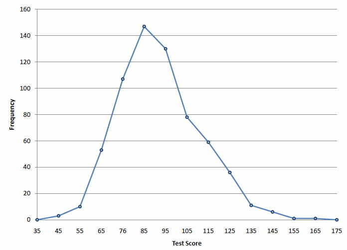
This is a line graph associated with a Frequency Distribution Table. A frequency polygon is obtained by plotting the Class Mark vs. the Frequency of that class. Then the points are joined with straight lines.
Ogive
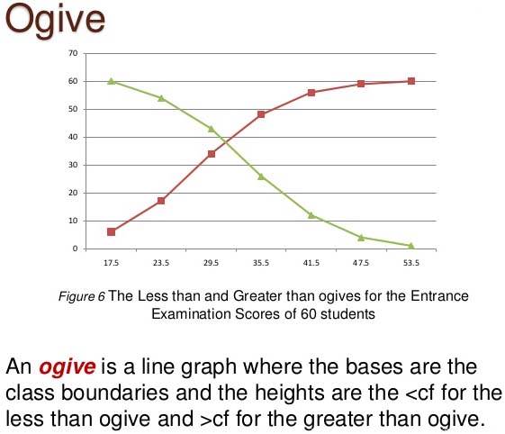
This is a graphical presentation of the cumulative frequency of a Frequency Distribution Table. It is constructed by plotting the lower true class boundary of each class vs. the cumulative frequency of the corresponding class. Then, the points are joined with straight lines.
Watch how to make graphs using Microsoft Excel.


Leave a Comment